 zabloo
Tu UI deja de ser parte de la build.
El juego incluye un SDK pequeño. Las pantallas viajan como datos: un envelope IR versionado que el SDK tesela en geometría de GPU. Cambia una pantalla, publica el envelope, y la build que ya está en las máquinas de los jugadores dibuja la nueva.
$ npm create zabloo-app
$ zabloo dev
→ preview on :5078
$ zabloo build
→ dist/zabloo.ir.json
Velo en marcha
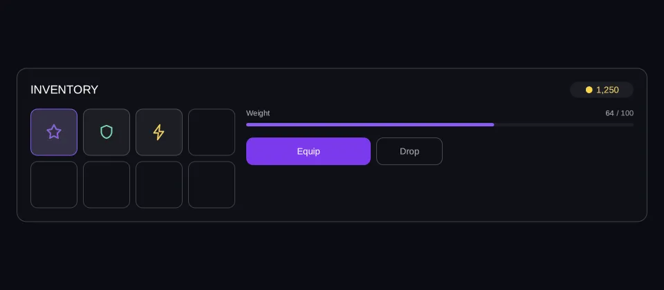
No es una imagen de la UI. Es la UI.
Este frame ejecuta el mismo renderer que ejecuta el SDK: su propio layout, su propio teselador, su propio atlas de glifos. Cambia los datos, mira cómo se recoloca y lee las actions que la UI devuelve al juego.
Viewport: 960 × 420
- hover — inactivo
- pressed — inactivo
- focused — inactivo
- selected — inactivo
- disabled — inactivo
Se leen del frame, no se le imponen.
Datos
Lo que el juego ha empujado a player.gold, ya formateado: la IR no tiene expresiones, así que formatear es trabajo del juego.
Escribe los dos paths que enlaza el panel: bag.weight, el número que lee el jugador, y bag.load, el 0–1 en el que está definida la barra.
Actions
- Pulsa algo en el frame y las actions aparecerán aquí.
Aún no se ha dibujado ningún frame
import { Button, Column, Image, ProgressBar, Row, Text } from "@zabloo/react";


/** Runs at authoring time — it is a plain array, not game data. */
const SLOTS: Array<{ id: string; icon?: string; tint?: string; equipped?: boolean }> = [
  { id: "relic", icon: "icons/star.png", tint: "{color.brand}", equipped: true },
  { id: "shield", icon: "icons/shield.png", tint: "#6ee7b7" },
  { id: "charge", icon: "icons/bolt.png", tint: "{color.gold}" },
  { id: "empty-1" },
  { id: "empty-2" },
  { id: "empty-3" },
  { id: "empty-4" },
  { id: "empty-5" },
];

/**
 * 68, not 76, and that is the whole reason the grid survives a phone: four
 * slots and their gaps come to 296, which still fits the 302 a 390-wide view
 * leaves after the paddings. A slot row that cannot fit the narrowest preset
 * would be clipped there rather than re-laid out.
 */
const SLOT_SIZE = 68;
const SLOT_COLUMN = SLOT_SIZE * 4 + 8 * 3;

export default function Inventory() {
  return (
    <Column
      // `align: "stretch"` on the ROOT is what hands the panel the view's own
      // width; centring it instead would pin the panel to its content and no
      // change of viewport could reach it.
      layout={{ grow: 1, justify: "center", align: "stretch", padding: "{space.6}" }}
      style={{ background: "{color.bg}" }}
    >
      <Column
        id="panel"
        // `align: "stretch"` is what gives the rows below the panel's full
        // width — without it they measure to their content and there is no
        // leftover space for `space-between` or `grow` to distribute.
        layout={{ padding: "{space.5}", gap: "{space.4}", align: "stretch" }}
        style={{
          background: "{color.surface}",
          radius: "{radius.lg}",
          borderWidth: "{border.hairline}",
          borderColor: "{color.line}",
        }}
      >
        {/* Header: title + the gold pill, whose amount is bound. */}
        <Row layout={{ justify: "space-between", align: "center" }}>
          <Text style={{ color: "{color.text}", fontSize: "{text.lg}" }}>INVENTORY</Text>
          <Row
            layout={{
              gap: "{space.1}",
              align: "center",
              padding: "{space.1}",
              width: 92,
              justify: "center",
            }}
            style={{ background: "{color.slot}", radius: "{radius.pill}" }}
          >
            <Image
              src="icons/coin.png"
              layout={{ width: 13, height: 13 }}
              style={{ color: "{color.gold}" }}
            />
            <Text bind="player.gold" style={{ color: "{color.gold}", fontSize: "{text.sm}" }} />
          </Row>
        </Row>

        {/* The body, and the one node that answers the viewport: a wrapping row
            whose two children carry a width, so the wrap point is arithmetic.
            296 + 16 + 260 = 572 fits the 872 a desktop leaves and does not fit
            the 302 a phone does, so the stats block drops under the slots
            exactly there — and `grow` then hands the stats block the rest of
            its line, which is what keeps the weight bar spanning the panel. The
            BUTTONS under it keep a width of their own: a primary action that
            stretches to 700px on a desktop is the leftover space reaching a
            child that had no use for it. */}
        <Row layout={{ wrap: true, gap: "{space.4}", align: "start" }}>
          {/* Eight slots in two rows of four. The map is authoring-time sugar. */}
          <Column layout={{ width: SLOT_COLUMN, gap: "{space.2}" }}>
            {[0, 4].map((offset) => (
              <Row key={offset} layout={{ gap: "{space.2}" }}>
                {SLOTS.slice(offset, offset + 4).map((slot) =>
                  slot.icon === undefined ? (
                    <Column
                      key={slot.id}
                      layout={{ width: SLOT_SIZE, height: SLOT_SIZE }}
                      style={{
                        radius: "{radius.md}",
                        borderWidth: "{border.hairline}",
                        borderColor: "{color.line}",
                      }}
                    />
                  ) : (
                    <Button
                      key={slot.id}
                      id={slot.id}
                      variant="slot"
                      onClick="slot-select"
                      layout={{
                        width: SLOT_SIZE,
                        height: SLOT_SIZE,
                        justify: "center",
                        align: "center",
                      }}
                      style={
                        slot.equipped
                          ? { background: "{color.brand-soft}", borderColor: "{color.brand}" }
                          : undefined
                      }
                    >
                      <Image
                        src={slot.icon}
                        layout={{ width: 26, height: 26 }}
                        style={{ color: slot.tint }}
                      />
                    </Button>
                  ),
                )}
              </Row>
            ))}
          </Column>

          <Column layout={{ width: 260, grow: 1, gap: "{space.4}", align: "stretch" }}>
            {/* Carried weight: the label and the bar read two different paths —
                the number the player sees, and the 0..1 the bar is defined in. */}
            <Column layout={{ gap: "{space.2}", align: "stretch" }}>
              <Row layout={{ justify: "space-between", align: "center" }}>
                <Text style={{ color: "{color.muted}", fontSize: "{text.xs}" }}>Weight</Text>
                <Row layout={{ gap: "{space.1}" }}>
                  <Text
                    bind="bag.weight"
                    style={{ color: "{color.muted}", fontSize: "{text.xs}" }}
                  />
                  <Text style={{ color: "{color.faint}", fontSize: "{text.xs}" }}>/ 100</Text>
                </Row>
              </Row>
              <ProgressBar
                id="weight-bar"
                value={{ bind: "bag.load" }}
                size={5}
                style={{ background: "{color.slot}", radius: "{radius.pill}" }}
                fill={{ background: "{color.brand}", radius: "{radius.pill}" }}
              />
            </Column>

            {/* The two actions the game subscribes to. */}
            <Row layout={{ gap: "{space.2}" }}>
              <Button
                id="equip"
                variant="primary"
                onClick="equip"
                layout={{ width: 180, height: 40, justify: "center", align: "center" }}
              >
                <Text style={{ color: "{color.on-brand}", fontSize: "{text.sm}" }}>Equip</Text>
              </Button>
              <Button
                id="drop"
                variant="secondary"
                onClick="drop"
                layout={{ width: 96, height: 40, justify: "center", align: "center" }}
              >
                <Text style={{ color: "{color.muted}", fontSize: "{text.sm}" }}>Drop</Text>
              </Button>
            </Row>
          </Column>
        </Row>
      </Column>
    </Column>
  );
}
{
"v": 1,
"tokens": {
"color.bg": "#0b0d13",
"color.surface": "#0e1016",
"color.raised": "#14141a",
"color.line": "#ffffff1f",
"color.line-strong": "#ffffff24",
"color.text": "#ffffff",
"color.muted": "#a1a1aa",
"color.faint": "#8a8a93",
"color.on-brand": "#ffffff",
"color.brand": "#8b5cf6",
"color.brand-strong": "#7c3aed",
"color.brand-hover": "#8b5cf6",
"color.brand-pressed": "#6d28d9",
"color.brand-soft": "#8b5cf61f",
"color.gold": "#fcd34d",
"color.slot": "#ffffff08",
"color.danger": "#f87171",
"radius.sm": 6,
"radius.md": 10,
"radius.lg": 14,
"radius.pill": 999,
"border.hairline": 1,
"border.focus": 2,
"space.1": 4,
"space.2": 8,
"space.3": 12,
"space.4": 16,
"space.5": 20,
"space.6": 24,
"text.xs": 11,
"text.sm": 13,
"text.md": 15,
"text.lg": 17,
"motion.fast": 120,
"motion.loop": 900
},
"views": {
"inventory": {
"type": "Container",
"layout": {
"direction": "column",
"grow": 1,
"justify": "center",
"align": "stretch",
"padding": "{space.6}"
},
"style": {
"background": "{color.bg}"
},
"children": [
{
"type": "Container",
"id": "panel",
"layout": {
"direction": "column",
"padding": "{space.5}",
"gap": "{space.4}",
"align": "stretch"
},
"style": {
"background": "{color.surface}",
"radius": "{radius.lg}",
"borderWidth": "{border.hairline}",
"borderColor": "{color.line}"
},
"children": [
{
"type": "Container",
"layout": {
"direction": "row",
"justify": "space-between",
"align": "center"
},
"children": [
{
"type": "Text",
"style": {
"color": "{color.text}",
"fontSize": "{text.lg}"
},
"text": "INVENTORY"
},
{
"type": "Container",
"layout": {
"direction": "row",
"gap": "{space.1}",
"align": "center",
"padding": "{space.1}",
"width": 92,
"justify": "center"
},
"style": {
"background": "{color.slot}",
"radius": "{radius.pill}"
},
"children": [
{
"type": "Image",
"layout": {
"width": 13,
"height": 13
},
"style": {
"color": "{color.gold}"
},
"src": "asset:icons/coin.png"
},
{
"type": "Text",
"style": {
"color": "{color.gold}",
"fontSize": "{text.sm}"
},
"text": {
"bind": "player.gold"
}
}
]
}
]
},
{
"type": "Container",
"layout": {
"direction": "row",
"wrap": true,
"gap": "{space.4}",
"align": "start"
},
"children": [
{
"type": "Container",
"layout": {
"direction": "column",
"width": 296,
"gap": "{space.2}"
},
"children": [
{
"type": "Container",
"layout": {
"direction": "row",
"gap": "{space.2}"
},
"children": [
{
"type": "Button",
"id": "relic",
"layout": {
"width": 68,
"height": 68,
"justify": "center",
"align": "center"
},
"style": {
"background": "{color.brand-soft}",
"borderWidth": "{border.hairline}",
"borderColor": "{color.brand}",
"radius": "{radius.md}"
},
"states": {
"hover": {
"style": {
"borderColor": "{color.line-strong}"
}
},
"selected": {
"style": {
"background": "{color.brand-soft}",
"borderColor": "{color.brand}"
}
},
"focused": {
"style": {
"borderWidth": "{border.focus}",
"borderColor": "{color.brand}"
}
}
},
"transition": {
"duration": "{motion.fast}"
},
"onClick": "slot-select",
"children": [
{
"type": "Image",
"layout": {
"width": 26,
"height": 26
},
"style": {
"color": "{color.brand}"
},
"src": "asset:icons/star.png"
}
]
},
{
"type": "Button",
"id": "shield",
"layout": {
"width": 68,
"height": 68,
"justify": "center",
"align": "center"
},
"style": {
"background": "{color.slot}",
"borderWidth": "{border.hairline}",
"borderColor": "{color.line}",
"radius": "{radius.md}"
},
"states": {
"hover": {
"style": {
"borderColor": "{color.line-strong}"
}
},
"selected": {
"style": {
"background": "{color.brand-soft}",
"borderColor": "{color.brand}"
}
},
"focused": {
"style": {
"borderWidth": "{border.focus}",
"borderColor": "{color.brand}"
}
}
},
"transition": {
"duration": "{motion.fast}"
},
"onClick": "slot-select",
"children": [
{
"type": "Image",
"layout": {
"width": 26,
"height": 26
},
"style": {
"color": "#6ee7b7"
},
"src": "asset:icons/shield.png"
}
]
},
{
"type": "Button",
"id": "charge",
"layout": {
"width": 68,
"height": 68,
"justify": "center",
"align": "center"
},
"style": {
"background": "{color.slot}",
"borderWidth": "{border.hairline}",
"borderColor": "{color.line}",
"radius": "{radius.md}"
},
"states": {
"hover": {
"style": {
"borderColor": "{color.line-strong}"
}
},
"selected": {
"style": {
"background": "{color.brand-soft}",
"borderColor": "{color.brand}"
}
},
"focused": {
"style": {
"borderWidth": "{border.focus}",
"borderColor": "{color.brand}"
}
}
},
"transition": {
"duration": "{motion.fast}"
},
"onClick": "slot-select",
"children": [
{
"type": "Image",
"layout": {
"width": 26,
"height": 26
},
"style": {
"color": "{color.gold}"
},
"src": "asset:icons/bolt.png"
}
]
},
{
"type": "Container",
"layout": {
"direction": "column",
"width": 68,
"height": 68
},
"style": {
"radius": "{radius.md}",
"borderWidth": "{border.hairline}",
"borderColor": "{color.line}"
}
}
]
},
{
"type": "Container",
"layout": {
"direction": "row",
"gap": "{space.2}"
},
"children": [
{
"type": "Container",
"layout": {
"direction": "column",
"width": 68,
"height": 68
},
"style": {
"radius": "{radius.md}",
"borderWidth": "{border.hairline}",
"borderColor": "{color.line}"
}
},
{
"type": "Container",
"layout": {
"direction": "column",
"width": 68,
"height": 68
},
"style": {
"radius": "{radius.md}",
"borderWidth": "{border.hairline}",
"borderColor": "{color.line}"
}
},
{
"type": "Container",
"layout": {
"direction": "column",
"width": 68,
"height": 68
},
"style": {
"radius": "{radius.md}",
"borderWidth": "{border.hairline}",
"borderColor": "{color.line}"
}
},
{
"type": "Container",
"layout": {
"direction": "column",
"width": 68,
"height": 68
},
"style": {
"radius": "{radius.md}",
"borderWidth": "{border.hairline}",
"borderColor": "{color.line}"
}
}
]
}
]
},
{
"type": "Container",
"layout": {
"direction": "column",
"width": 260,
"grow": 1,
"gap": "{space.4}",
"align": "stretch"
},
"children": [
{
"type": "Container",
"layout": {
"direction": "column",
"gap": "{space.2}",
"align": "stretch"
},
"children": [
{
"type": "Container",
"layout": {
"direction": "row",
"justify": "space-between",
"align": "center"
},
"children": [
{
"type": "Text",
"style": {
"color": "{color.muted}",
"fontSize": "{text.xs}"
},
"text": "Weight"
},
{
"type": "Container",
"layout": {
"direction": "row",
"gap": "{space.1}"
},
"children": [
{
"type": "Text",
"style": {
"color": "{color.muted}",
"fontSize": "{text.xs}"
},
"text": {
"bind": "bag.weight"
}
},
{
"type": "Text",
"style": {
"color": "{color.faint}",
"fontSize": "{text.xs}"
},
"text": "/ 100"
}
]
}
]
},
{
"type": "ProgressBar",
"id": "weight-bar",
"layout": {
"direction": "row",
"height": 5
},
"style": {
"background": "{color.slot}",
"radius": "{radius.pill}"
},
"clip": true,
"value": {
"bind": "bag.load"
},
"children": [
{
"type": "Container",
"style": {
"background": "{color.brand}",
"radius": "{radius.pill}"
}
}
]
}
]
},
{
"type": "Container",
"layout": {
"direction": "row",
"gap": "{space.2}"
},
"children": [
{
"type": "Button",
"id": "equip",
"layout": {
"width": 180,
"height": 40,
"justify": "center",
"align": "center"
},
"style": {
"background": "{color.brand-strong}",
"radius": "{radius.md}",
"color": "{color.on-brand}"
},
"states": {
"hover": {
"style": {
"background": "{color.brand-hover}"
}
},
"pressed": {
"style": {
"background": "{color.brand-pressed}"
}
},
"focused": {
"style": {
"borderWidth": "{border.focus}",
"borderColor": "{color.brand}"
}
},
"disabled": {
"style": {
"opacity": 0.45
}
}
},
"transition": {
"duration": "{motion.fast}"
},
"onClick": "equip",
"children": [
{
"type": "Text",
"style": {
"color": "{color.on-brand}",
"fontSize": "{text.sm}"
},
"text": "Equip"
}
]
},
{
"type": "Button",
"id": "drop",
"layout": {
"width": 96,
"height": 40,
"justify": "center",
"align": "center"
},
"style": {
"background": "#00000000",
"borderWidth": "{border.hairline}",
"borderColor": "{color.line-strong}",
"radius": "{radius.md}",
"color": "{color.text}"
},
"states": {
"hover": {
"style": {
"background": "{color.slot}"
}
},
"pressed": {
"style": {
"background": "{color.brand-soft}"
}
},
"focused": {
"style": {
"borderWidth": "{border.focus}",
"borderColor": "{color.brand}"
}
},
"disabled": {
"style": {
"opacity": 0.45
}
}
},
"transition": {
"duration": "{motion.fast}"
},
"onClick": "drop",
"children": [
{
"type": "Text",
"style": {
"color": "{color.muted}",
"fontSize": "{text.sm}"
},
"text": "Drop"
}
]
}
]
}
]
}
]
}
]
}
]
}
},
"assets": {
"icons/bolt.png": {
"hash": "07ac2ea21678f0a21ac34d25f30670ee76b56b3ea8e7d1e98aea339505654adf",
"mime": "image/png",
"size": 599,
"width": 64,
"height": 64,
"data": "iVBORw0KGgoA… (599 bytes, base64)"
},
"icons/coin.png": {
"hash": "639e274e3c946532ff6cead9d024daf85a8336f22478af69f0f4b1fe2042619d",
"mime": "image/png",
"size": 454,
"width": 64,
"height": 64,
"data": "iVBORw0KGgoA… (454 bytes, base64)"
},
"icons/shield.png": {
"hash": "cf3786285ac535ea549843224e903d3c573b903faf4ad507ab572aca76895cdb",
"mime": "image/png",
"size": 573,
"width": 64,
"height": 64,
"data": "iVBORw0KGgoA… (573 bytes, base64)"
},
"icons/star.png": {
"hash": "02f69f8ed48938f7704d264cd732afec0762fd8fd654944876443c87ed3cb1bd",
"mime": "image/png",
"size": 689,
"width": 64,
"height": 64,
"data": "iVBORw0KGgoA… (689 bytes, base64)"
}
}
}Qué lleva el formato
Seis cosas que el SDK sabe hacer.
Layout
Un subconjunto de Flexbox que todos los targets implementan igual: direction, justify, align, gap, grow, wrap.
Tokens y theming
Colores, espaciado y radios se resuelven a través de un diccionario en el envelope. Cambia la piel sin tocar una pantalla.
Bindings
Texto, visibilidad y estado checked leen de rutas de datos que posee el juego. Escribe una vez y la UI se recoloca.
Named actions
La UI emite nombres, no callbacks. El juego se suscribe a «buy» y nunca sabe qué dibujó el botón.
Input y focus
Puntero, teclado y gamepad. La navegación direccional y los focus traps son parte del formato, no de tu código.
Degradation
Un SDK más viejo que el contenido que recibe es un caso normal. Los nodos desconocidos degradan por regla, nunca a un crash.
En el motor
Carga un envelope. Escucha las actions.
Esa es toda la superficie de integración. El SDK es dueño del dibujo y del input; tu juego, de los datos y de qué significa cada nombre.
- Ni prefab por pantalla ni cableado de escenas
- Un solo draw path, sea cual sea la pantalla
- Cambia el envelope en runtime y conserva la sesión
var ui = Zabloo.Mount("shop");

ui.OnAction("buy", ctx => {
    Economy.Purchase(ctx.Path);
});

ui.SetData("player.gold", 1250);
Pon tu UI en la próxima build.
El SDK es open source y gratis. Empieza con una pantalla y mira hasta dónde te lleva el formato.