 zabloo
Your UI stops being part of the build.
The game ships a small SDK. The screens ship as data — a versioned IR envelope the SDK tessellates into GPU geometry. Change a screen, publish the envelope, and the build that is already on players' machines draws the new one.
$ npm create zabloo-app
$ zabloo dev
→ preview on :5078
$ zabloo build
→ dist/zabloo.ir.json
See it run
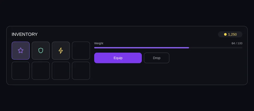
Not a picture of the UI. The UI.
This frame runs the same renderer the SDK runs — its own layout pass, its own tessellator, its own glyph atlas. Drive the data, watch it re-lay out, and read the actions the UI hands back to the game.
Viewport: 960 × 420
- hover — off
- pressed — off
- focused — off
- selected — off
- disabled — off
Reported from the frame, not forced onto it.
Data
What the game has pushed into player.gold, already formatted — the IR has no expressions, so formatting is the game's job.
Writes both paths the panel binds: bag.weight, the number the player reads, and bag.load, the 0–1 the bar is defined in.
Actions
- Press something in the frame and the actions land here.
No frame drawn yet
import { Button, Column, Image, ProgressBar, Row, Text } from "@zabloo/react";


/** Runs at authoring time — it is a plain array, not game data. */
const SLOTS: Array<{ id: string; icon?: string; tint?: string; equipped?: boolean }> = [
  { id: "relic", icon: "icons/star.png", tint: "{color.brand}", equipped: true },
  { id: "shield", icon: "icons/shield.png", tint: "#6ee7b7" },
  { id: "charge", icon: "icons/bolt.png", tint: "{color.gold}" },
  { id: "empty-1" },
  { id: "empty-2" },
  { id: "empty-3" },
  { id: "empty-4" },
  { id: "empty-5" },
];

/**
 * 68, not 76, and that is the whole reason the grid survives a phone: four
 * slots and their gaps come to 296, which still fits the 302 a 390-wide view
 * leaves after the paddings. A slot row that cannot fit the narrowest preset
 * would be clipped there rather than re-laid out.
 */
const SLOT_SIZE = 68;
const SLOT_COLUMN = SLOT_SIZE * 4 + 8 * 3;

export default function Inventory() {
  return (
    <Column
      // `align: "stretch"` on the ROOT is what hands the panel the view's own
      // width; centring it instead would pin the panel to its content and no
      // change of viewport could reach it.
      layout={{ grow: 1, justify: "center", align: "stretch", padding: "{space.6}" }}
      style={{ background: "{color.bg}" }}
    >
      <Column
        id="panel"
        // `align: "stretch"` is what gives the rows below the panel's full
        // width — without it they measure to their content and there is no
        // leftover space for `space-between` or `grow` to distribute.
        layout={{ padding: "{space.5}", gap: "{space.4}", align: "stretch" }}
        style={{
          background: "{color.surface}",
          radius: "{radius.lg}",
          borderWidth: "{border.hairline}",
          borderColor: "{color.line}",
        }}
      >
        {/* Header: title + the gold pill, whose amount is bound. */}
        <Row layout={{ justify: "space-between", align: "center" }}>
          <Text style={{ color: "{color.text}", fontSize: "{text.lg}" }}>INVENTORY</Text>
          <Row
            layout={{
              gap: "{space.1}",
              align: "center",
              padding: "{space.1}",
              width: 92,
              justify: "center",
            }}
            style={{ background: "{color.slot}", radius: "{radius.pill}" }}
          >
            <Image
              src="icons/coin.png"
              layout={{ width: 13, height: 13 }}
              style={{ color: "{color.gold}" }}
            />
            <Text bind="player.gold" style={{ color: "{color.gold}", fontSize: "{text.sm}" }} />
          </Row>
        </Row>

        {/* The body, and the one node that answers the viewport: a wrapping row
            whose two children carry a width, so the wrap point is arithmetic.
            296 + 16 + 260 = 572 fits the 872 a desktop leaves and does not fit
            the 302 a phone does, so the stats block drops under the slots
            exactly there — and `grow` then hands the stats block the rest of
            its line, which is what keeps the weight bar spanning the panel. The
            BUTTONS under it keep a width of their own: a primary action that
            stretches to 700px on a desktop is the leftover space reaching a
            child that had no use for it. */}
        <Row layout={{ wrap: true, gap: "{space.4}", align: "start" }}>
          {/* Eight slots in two rows of four. The map is authoring-time sugar. */}
          <Column layout={{ width: SLOT_COLUMN, gap: "{space.2}" }}>
            {[0, 4].map((offset) => (
              <Row key={offset} layout={{ gap: "{space.2}" }}>
                {SLOTS.slice(offset, offset + 4).map((slot) =>
                  slot.icon === undefined ? (
                    <Column
                      key={slot.id}
                      layout={{ width: SLOT_SIZE, height: SLOT_SIZE }}
                      style={{
                        radius: "{radius.md}",
                        borderWidth: "{border.hairline}",
                        borderColor: "{color.line}",
                      }}
                    />
                  ) : (
                    <Button
                      key={slot.id}
                      id={slot.id}
                      variant="slot"
                      onClick="slot-select"
                      layout={{
                        width: SLOT_SIZE,
                        height: SLOT_SIZE,
                        justify: "center",
                        align: "center",
                      }}
                      style={
                        slot.equipped
                          ? { background: "{color.brand-soft}", borderColor: "{color.brand}" }
                          : undefined
                      }
                    >
                      <Image
                        src={slot.icon}
                        layout={{ width: 26, height: 26 }}
                        style={{ color: slot.tint }}
                      />
                    </Button>
                  ),
                )}
              </Row>
            ))}
          </Column>

          <Column layout={{ width: 260, grow: 1, gap: "{space.4}", align: "stretch" }}>
            {/* Carried weight: the label and the bar read two different paths —
                the number the player sees, and the 0..1 the bar is defined in. */}
            <Column layout={{ gap: "{space.2}", align: "stretch" }}>
              <Row layout={{ justify: "space-between", align: "center" }}>
                <Text style={{ color: "{color.muted}", fontSize: "{text.xs}" }}>Weight</Text>
                <Row layout={{ gap: "{space.1}" }}>
                  <Text
                    bind="bag.weight"
                    style={{ color: "{color.muted}", fontSize: "{text.xs}" }}
                  />
                  <Text style={{ color: "{color.faint}", fontSize: "{text.xs}" }}>/ 100</Text>
                </Row>
              </Row>
              <ProgressBar
                id="weight-bar"
                value={{ bind: "bag.load" }}
                size={5}
                style={{ background: "{color.slot}", radius: "{radius.pill}" }}
                fill={{ background: "{color.brand}", radius: "{radius.pill}" }}
              />
            </Column>

            {/* The two actions the game subscribes to. */}
            <Row layout={{ gap: "{space.2}" }}>
              <Button
                id="equip"
                variant="primary"
                onClick="equip"
                layout={{ width: 180, height: 40, justify: "center", align: "center" }}
              >
                <Text style={{ color: "{color.on-brand}", fontSize: "{text.sm}" }}>Equip</Text>
              </Button>
              <Button
                id="drop"
                variant="secondary"
                onClick="drop"
                layout={{ width: 96, height: 40, justify: "center", align: "center" }}
              >
                <Text style={{ color: "{color.muted}", fontSize: "{text.sm}" }}>Drop</Text>
              </Button>
            </Row>
          </Column>
        </Row>
      </Column>
    </Column>
  );
}
{
"v": 1,
"tokens": {
"color.bg": "#0b0d13",
"color.surface": "#0e1016",
"color.raised": "#14141a",
"color.line": "#ffffff1f",
"color.line-strong": "#ffffff24",
"color.text": "#ffffff",
"color.muted": "#a1a1aa",
"color.faint": "#8a8a93",
"color.on-brand": "#ffffff",
"color.brand": "#8b5cf6",
"color.brand-strong": "#7c3aed",
"color.brand-hover": "#8b5cf6",
"color.brand-pressed": "#6d28d9",
"color.brand-soft": "#8b5cf61f",
"color.gold": "#fcd34d",
"color.slot": "#ffffff08",
"color.danger": "#f87171",
"radius.sm": 6,
"radius.md": 10,
"radius.lg": 14,
"radius.pill": 999,
"border.hairline": 1,
"border.focus": 2,
"space.1": 4,
"space.2": 8,
"space.3": 12,
"space.4": 16,
"space.5": 20,
"space.6": 24,
"text.xs": 11,
"text.sm": 13,
"text.md": 15,
"text.lg": 17,
"motion.fast": 120,
"motion.loop": 900
},
"views": {
"inventory": {
"type": "Container",
"layout": {
"direction": "column",
"grow": 1,
"justify": "center",
"align": "stretch",
"padding": "{space.6}"
},
"style": {
"background": "{color.bg}"
},
"children": [
{
"type": "Container",
"id": "panel",
"layout": {
"direction": "column",
"padding": "{space.5}",
"gap": "{space.4}",
"align": "stretch"
},
"style": {
"background": "{color.surface}",
"radius": "{radius.lg}",
"borderWidth": "{border.hairline}",
"borderColor": "{color.line}"
},
"children": [
{
"type": "Container",
"layout": {
"direction": "row",
"justify": "space-between",
"align": "center"
},
"children": [
{
"type": "Text",
"style": {
"color": "{color.text}",
"fontSize": "{text.lg}"
},
"text": "INVENTORY"
},
{
"type": "Container",
"layout": {
"direction": "row",
"gap": "{space.1}",
"align": "center",
"padding": "{space.1}",
"width": 92,
"justify": "center"
},
"style": {
"background": "{color.slot}",
"radius": "{radius.pill}"
},
"children": [
{
"type": "Image",
"layout": {
"width": 13,
"height": 13
},
"style": {
"color": "{color.gold}"
},
"src": "asset:icons/coin.png"
},
{
"type": "Text",
"style": {
"color": "{color.gold}",
"fontSize": "{text.sm}"
},
"text": {
"bind": "player.gold"
}
}
]
}
]
},
{
"type": "Container",
"layout": {
"direction": "row",
"wrap": true,
"gap": "{space.4}",
"align": "start"
},
"children": [
{
"type": "Container",
"layout": {
"direction": "column",
"width": 296,
"gap": "{space.2}"
},
"children": [
{
"type": "Container",
"layout": {
"direction": "row",
"gap": "{space.2}"
},
"children": [
{
"type": "Button",
"id": "relic",
"layout": {
"width": 68,
"height": 68,
"justify": "center",
"align": "center"
},
"style": {
"background": "{color.brand-soft}",
"borderWidth": "{border.hairline}",
"borderColor": "{color.brand}",
"radius": "{radius.md}"
},
"states": {
"hover": {
"style": {
"borderColor": "{color.line-strong}"
}
},
"selected": {
"style": {
"background": "{color.brand-soft}",
"borderColor": "{color.brand}"
}
},
"focused": {
"style": {
"borderWidth": "{border.focus}",
"borderColor": "{color.brand}"
}
}
},
"transition": {
"duration": "{motion.fast}"
},
"onClick": "slot-select",
"children": [
{
"type": "Image",
"layout": {
"width": 26,
"height": 26
},
"style": {
"color": "{color.brand}"
},
"src": "asset:icons/star.png"
}
]
},
{
"type": "Button",
"id": "shield",
"layout": {
"width": 68,
"height": 68,
"justify": "center",
"align": "center"
},
"style": {
"background": "{color.slot}",
"borderWidth": "{border.hairline}",
"borderColor": "{color.line}",
"radius": "{radius.md}"
},
"states": {
"hover": {
"style": {
"borderColor": "{color.line-strong}"
}
},
"selected": {
"style": {
"background": "{color.brand-soft}",
"borderColor": "{color.brand}"
}
},
"focused": {
"style": {
"borderWidth": "{border.focus}",
"borderColor": "{color.brand}"
}
}
},
"transition": {
"duration": "{motion.fast}"
},
"onClick": "slot-select",
"children": [
{
"type": "Image",
"layout": {
"width": 26,
"height": 26
},
"style": {
"color": "#6ee7b7"
},
"src": "asset:icons/shield.png"
}
]
},
{
"type": "Button",
"id": "charge",
"layout": {
"width": 68,
"height": 68,
"justify": "center",
"align": "center"
},
"style": {
"background": "{color.slot}",
"borderWidth": "{border.hairline}",
"borderColor": "{color.line}",
"radius": "{radius.md}"
},
"states": {
"hover": {
"style": {
"borderColor": "{color.line-strong}"
}
},
"selected": {
"style": {
"background": "{color.brand-soft}",
"borderColor": "{color.brand}"
}
},
"focused": {
"style": {
"borderWidth": "{border.focus}",
"borderColor": "{color.brand}"
}
}
},
"transition": {
"duration": "{motion.fast}"
},
"onClick": "slot-select",
"children": [
{
"type": "Image",
"layout": {
"width": 26,
"height": 26
},
"style": {
"color": "{color.gold}"
},
"src": "asset:icons/bolt.png"
}
]
},
{
"type": "Container",
"layout": {
"direction": "column",
"width": 68,
"height": 68
},
"style": {
"radius": "{radius.md}",
"borderWidth": "{border.hairline}",
"borderColor": "{color.line}"
}
}
]
},
{
"type": "Container",
"layout": {
"direction": "row",
"gap": "{space.2}"
},
"children": [
{
"type": "Container",
"layout": {
"direction": "column",
"width": 68,
"height": 68
},
"style": {
"radius": "{radius.md}",
"borderWidth": "{border.hairline}",
"borderColor": "{color.line}"
}
},
{
"type": "Container",
"layout": {
"direction": "column",
"width": 68,
"height": 68
},
"style": {
"radius": "{radius.md}",
"borderWidth": "{border.hairline}",
"borderColor": "{color.line}"
}
},
{
"type": "Container",
"layout": {
"direction": "column",
"width": 68,
"height": 68
},
"style": {
"radius": "{radius.md}",
"borderWidth": "{border.hairline}",
"borderColor": "{color.line}"
}
},
{
"type": "Container",
"layout": {
"direction": "column",
"width": 68,
"height": 68
},
"style": {
"radius": "{radius.md}",
"borderWidth": "{border.hairline}",
"borderColor": "{color.line}"
}
}
]
}
]
},
{
"type": "Container",
"layout": {
"direction": "column",
"width": 260,
"grow": 1,
"gap": "{space.4}",
"align": "stretch"
},
"children": [
{
"type": "Container",
"layout": {
"direction": "column",
"gap": "{space.2}",
"align": "stretch"
},
"children": [
{
"type": "Container",
"layout": {
"direction": "row",
"justify": "space-between",
"align": "center"
},
"children": [
{
"type": "Text",
"style": {
"color": "{color.muted}",
"fontSize": "{text.xs}"
},
"text": "Weight"
},
{
"type": "Container",
"layout": {
"direction": "row",
"gap": "{space.1}"
},
"children": [
{
"type": "Text",
"style": {
"color": "{color.muted}",
"fontSize": "{text.xs}"
},
"text": {
"bind": "bag.weight"
}
},
{
"type": "Text",
"style": {
"color": "{color.faint}",
"fontSize": "{text.xs}"
},
"text": "/ 100"
}
]
}
]
},
{
"type": "ProgressBar",
"id": "weight-bar",
"layout": {
"direction": "row",
"height": 5
},
"style": {
"background": "{color.slot}",
"radius": "{radius.pill}"
},
"clip": true,
"value": {
"bind": "bag.load"
},
"children": [
{
"type": "Container",
"style": {
"background": "{color.brand}",
"radius": "{radius.pill}"
}
}
]
}
]
},
{
"type": "Container",
"layout": {
"direction": "row",
"gap": "{space.2}"
},
"children": [
{
"type": "Button",
"id": "equip",
"layout": {
"width": 180,
"height": 40,
"justify": "center",
"align": "center"
},
"style": {
"background": "{color.brand-strong}",
"radius": "{radius.md}",
"color": "{color.on-brand}"
},
"states": {
"hover": {
"style": {
"background": "{color.brand-hover}"
}
},
"pressed": {
"style": {
"background": "{color.brand-pressed}"
}
},
"focused": {
"style": {
"borderWidth": "{border.focus}",
"borderColor": "{color.brand}"
}
},
"disabled": {
"style": {
"opacity": 0.45
}
}
},
"transition": {
"duration": "{motion.fast}"
},
"onClick": "equip",
"children": [
{
"type": "Text",
"style": {
"color": "{color.on-brand}",
"fontSize": "{text.sm}"
},
"text": "Equip"
}
]
},
{
"type": "Button",
"id": "drop",
"layout": {
"width": 96,
"height": 40,
"justify": "center",
"align": "center"
},
"style": {
"background": "#00000000",
"borderWidth": "{border.hairline}",
"borderColor": "{color.line-strong}",
"radius": "{radius.md}",
"color": "{color.text}"
},
"states": {
"hover": {
"style": {
"background": "{color.slot}"
}
},
"pressed": {
"style": {
"background": "{color.brand-soft}"
}
},
"focused": {
"style": {
"borderWidth": "{border.focus}",
"borderColor": "{color.brand}"
}
},
"disabled": {
"style": {
"opacity": 0.45
}
}
},
"transition": {
"duration": "{motion.fast}"
},
"onClick": "drop",
"children": [
{
"type": "Text",
"style": {
"color": "{color.muted}",
"fontSize": "{text.sm}"
},
"text": "Drop"
}
]
}
]
}
]
}
]
}
]
}
]
}
},
"assets": {
"icons/bolt.png": {
"hash": "07ac2ea21678f0a21ac34d25f30670ee76b56b3ea8e7d1e98aea339505654adf",
"mime": "image/png",
"size": 599,
"width": 64,
"height": 64,
"data": "iVBORw0KGgoA… (599 bytes, base64)"
},
"icons/coin.png": {
"hash": "639e274e3c946532ff6cead9d024daf85a8336f22478af69f0f4b1fe2042619d",
"mime": "image/png",
"size": 454,
"width": 64,
"height": 64,
"data": "iVBORw0KGgoA… (454 bytes, base64)"
},
"icons/shield.png": {
"hash": "cf3786285ac535ea549843224e903d3c573b903faf4ad507ab572aca76895cdb",
"mime": "image/png",
"size": 573,
"width": 64,
"height": 64,
"data": "iVBORw0KGgoA… (573 bytes, base64)"
},
"icons/star.png": {
"hash": "02f69f8ed48938f7704d264cd732afec0762fd8fd654944876443c87ed3cb1bd",
"mime": "image/png",
"size": 689,
"width": 64,
"height": 64,
"data": "iVBORw0KGgoA… (689 bytes, base64)"
}
}
}What the format carries
Six things the SDK knows how to do.
Layout
A Flexbox subset every target implements identically — direction, justify, align, gap, grow, wrap.
Tokens & theming
Colours, spacing and radii resolve through a dictionary in the envelope. Reskin without touching a screen.
Bindings
Text, visibility and checked state read from data paths the game owns. Write once, the UI re-lays out.
Named actions
The UI fires names, not callbacks. The game subscribes to “buy” and never learns what drew the button.
Input & focus
Pointer, keyboard and gamepad. Directional navigation and focus traps are part of the format, not your code.
Degradation
An SDK older than the content it receives is a normal case. Unknown nodes fall back by rule, never to a crash.
In the engine
Load an envelope. Hear the actions.
That is the whole integration surface. The SDK owns drawing and input; your game owns the data and what a name means.
- No prefab per screen, no scene wiring
- One draw path, whatever the screen
- Swap the envelope at runtime, keep the session
var ui = Zabloo.Mount("shop");

ui.OnAction("buy", ctx => {
    Economy.Purchase(ctx.Path);
});

ui.SetData("player.gold", 1250);
Put your UI on the next build.
The SDK is open source and free. Start with a screen and see how far the format takes you.